
All posts
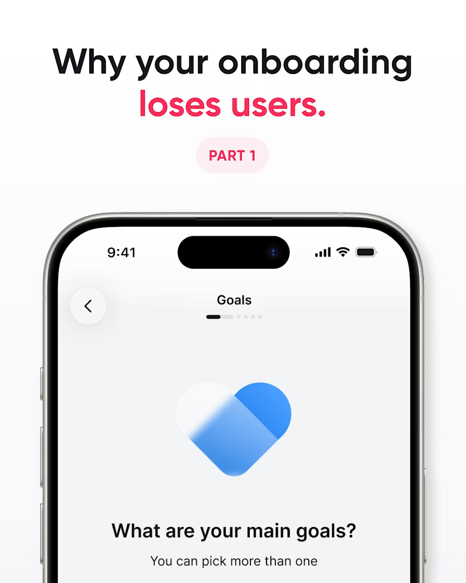
Cover: “Why your onboarding loses users. Part 1,” over a phone with an onboarding screen that asks “What are your main goals?”
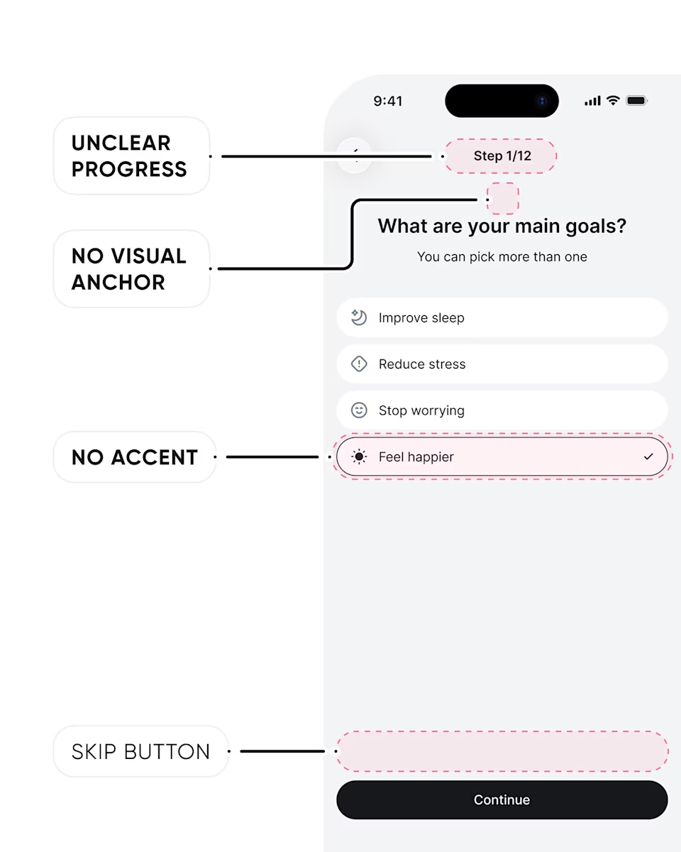
The original goals screen, annotated with four problems: unclear progress (Step 1/12), no visual anchor, no accent on the selected answer, and no skip button.
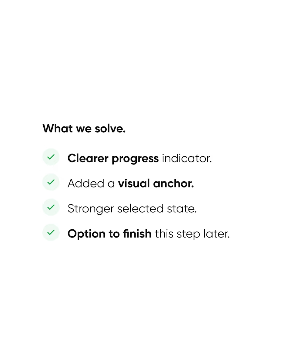
What we solve: a clearer progress indicator, an added visual anchor, a stronger selected state, and an option to finish the step later.
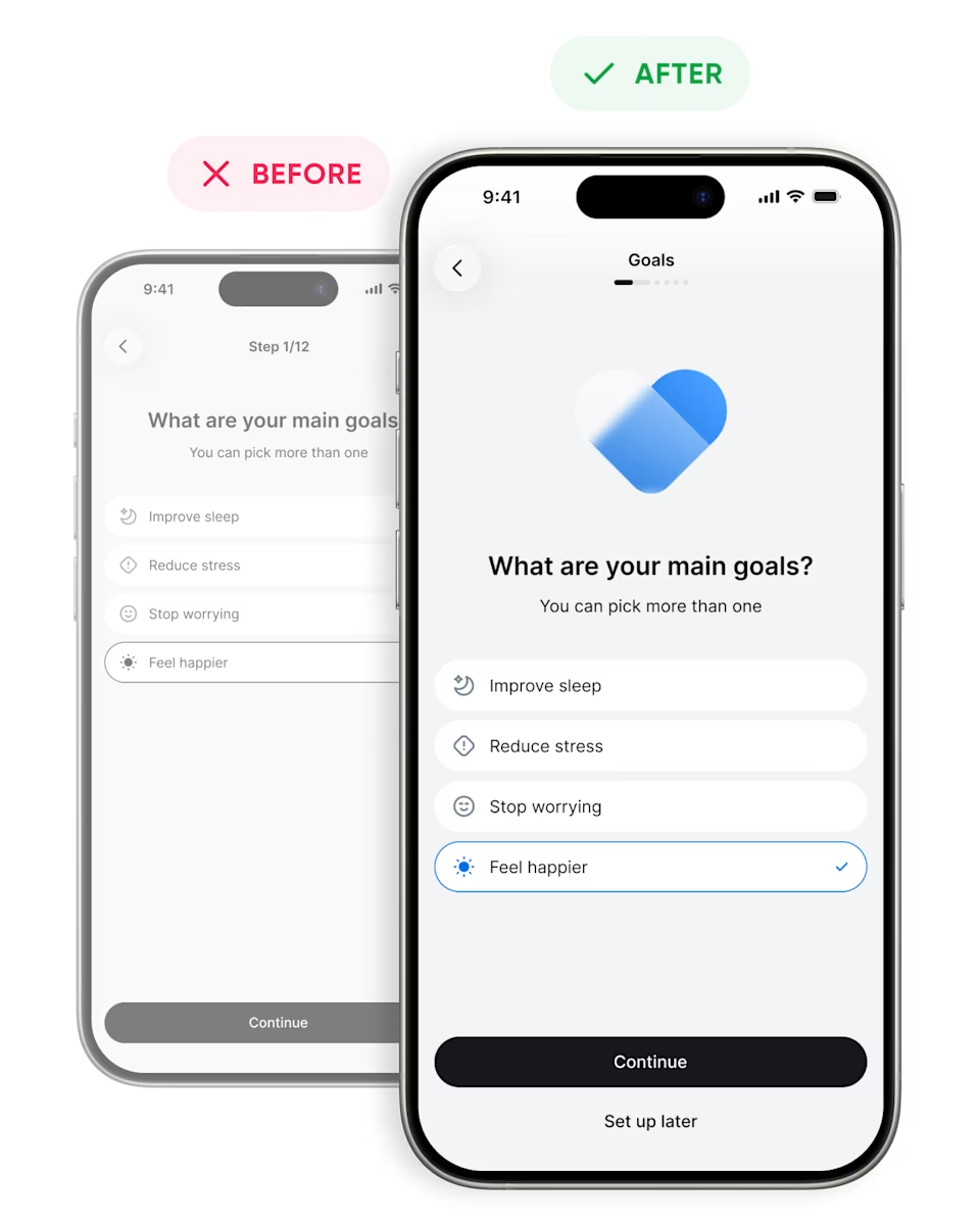
Before and after: the original goals screen next to the redesign, with a progress bar, a heart illustration, a highlighted answer, and a “Set up later” link.
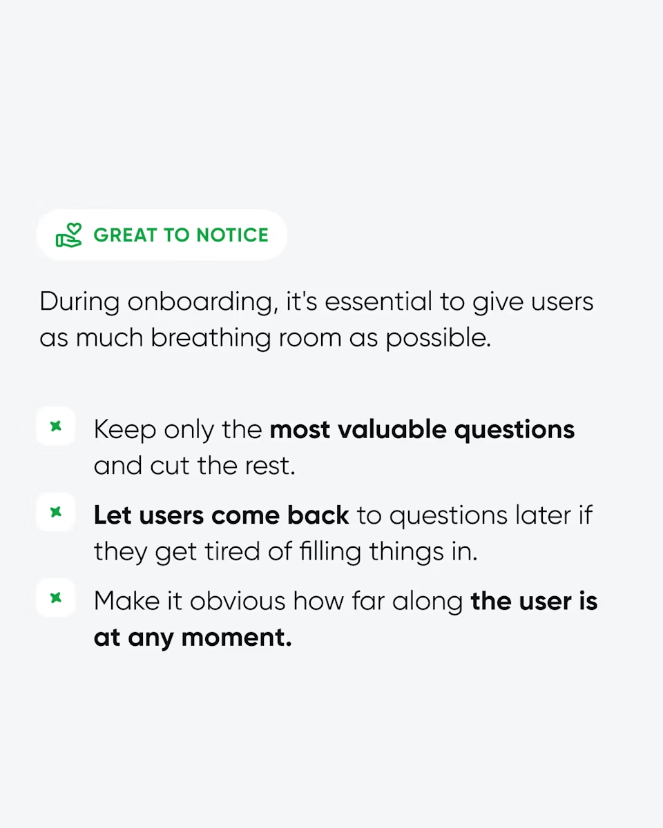
Great to notice: give users breathing room during onboarding. Keep only the most valuable questions, let users come back to them later, and show how far along they are.
Closing slide: “Reliqio. Your tech partner. AI, Healthtech, Fintech.” Stay tuned for part 2. Ready to talk? reliqio.com.

App onboarding design: one screen, four fixes.

Slide 1 of 6

Reliqio

App onboarding design: one screen, four fixes.

A Step 1 of 12 counter tells new users how much work is ahead before they've seen any value.

So we redesigned one goals screen:

  • Progress you can read at a glance.

  • A visual anchor that gives the question a focus.

  • A selected answer nobody can miss.

  • A Set up later option for anyone who wants to move on.

None of these is a new feature. They give users room to breathe, which is what gets them through onboarding.

Our rule: ask only what you need right now, and let people come back to the rest.

Losing users during onboarding? Let's look at it together.

#AppOnboarding #ProductDesign