All posts
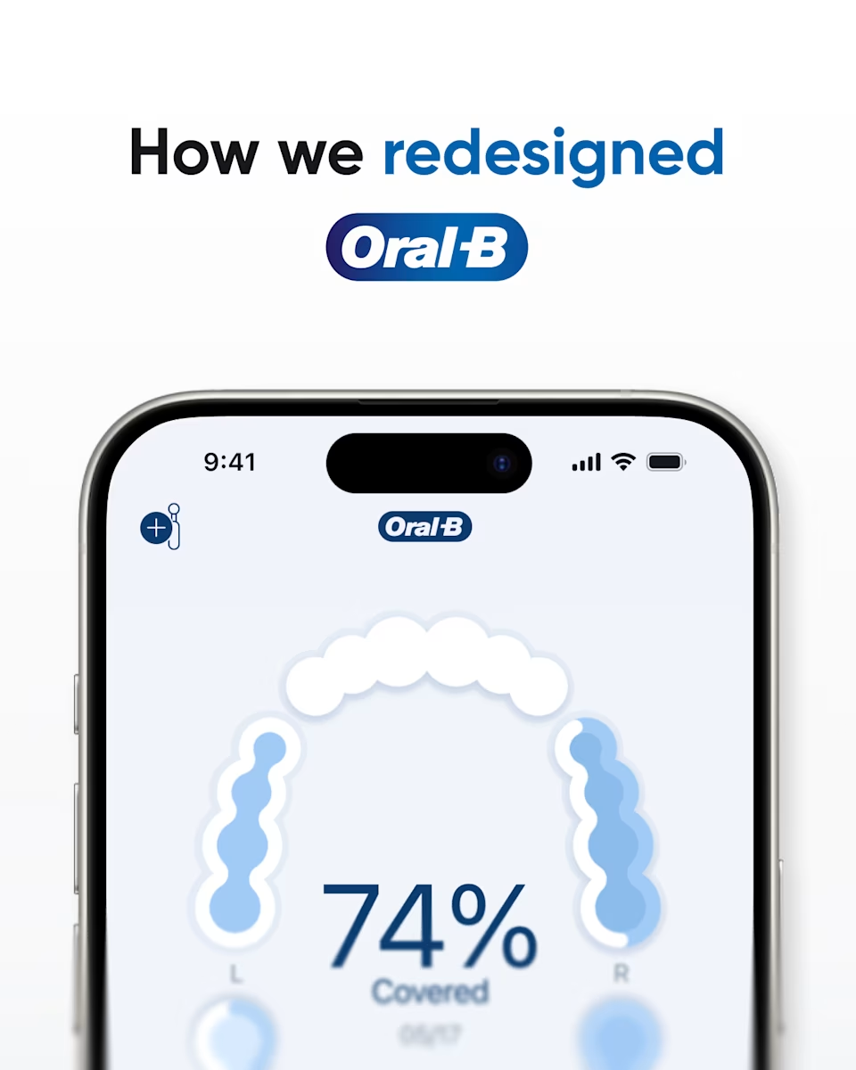
Title slide: “How we redesigned Oral-B,” with the Oral-B app’s brushing coverage screen at 74% on an iPhone.
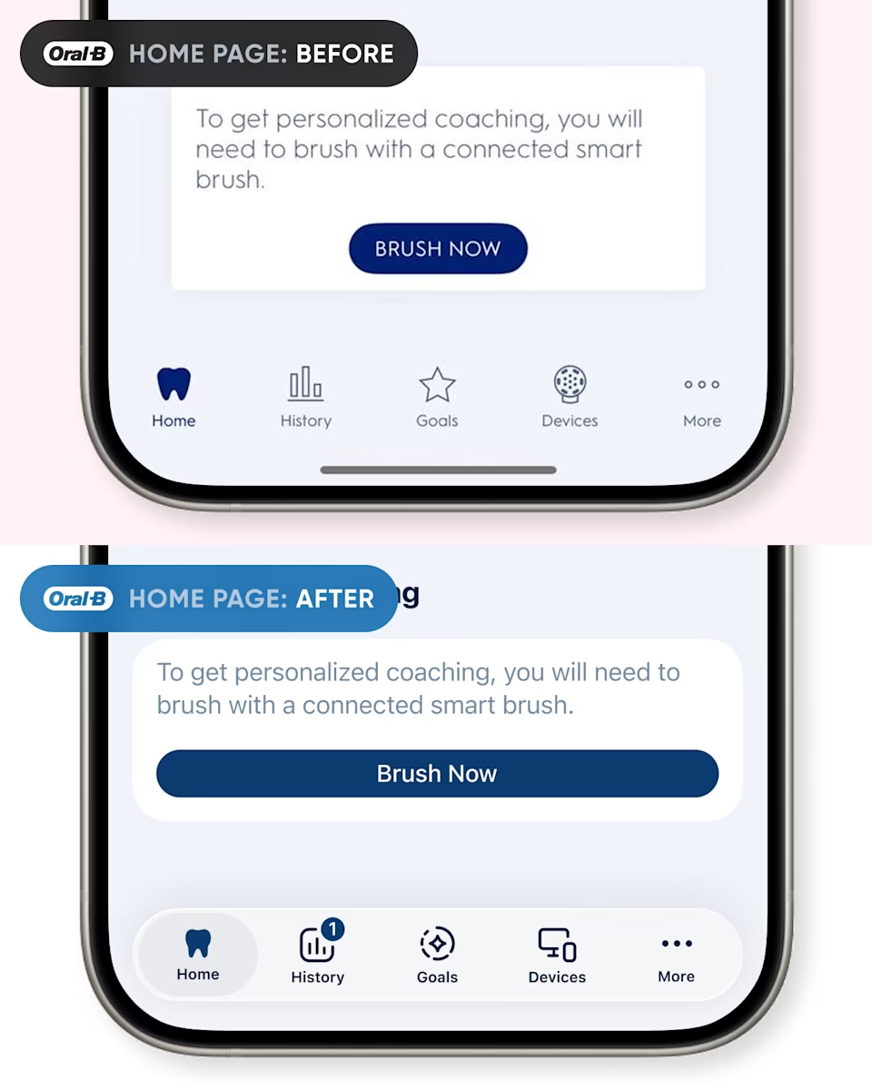
Oral-B home page before and after: the Brush Now card with a small button, and the redesigned card with a full-width button.
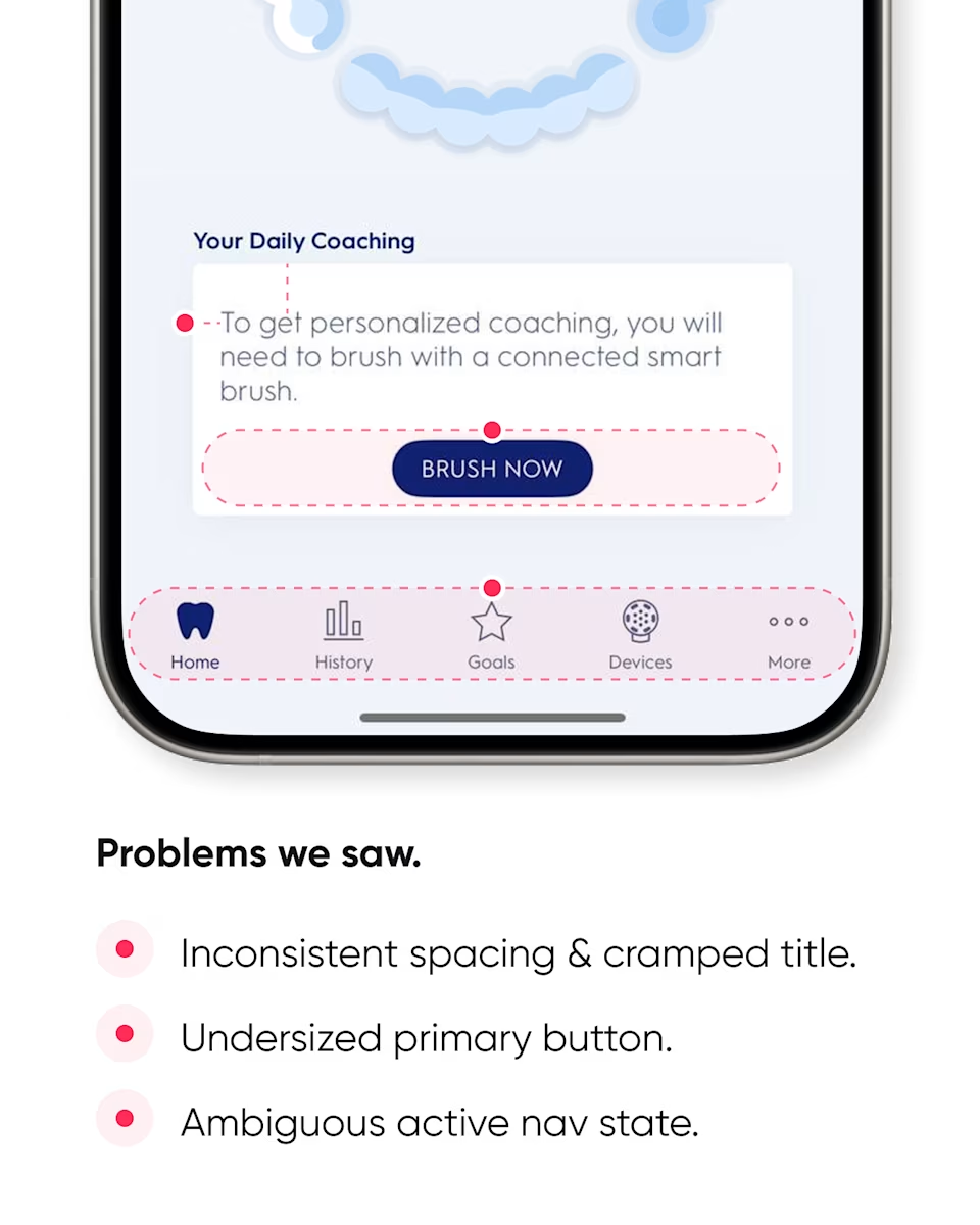
Home page problems: inconsistent spacing and a cramped title, an undersized primary button, and an ambiguous active navigation state.
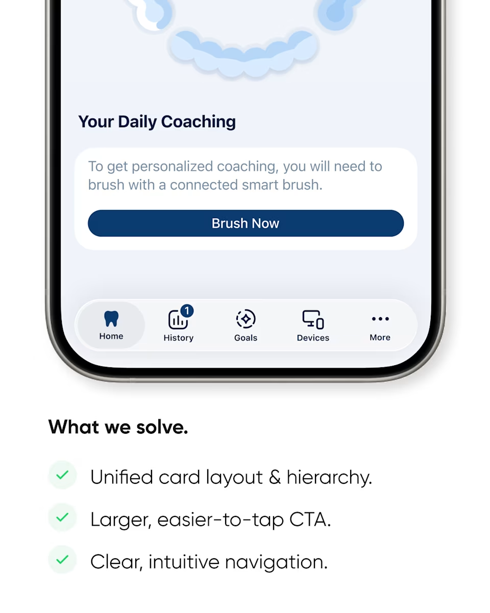
What we solved on the home page: a unified card layout and hierarchy, a larger, easier-to-tap button, and clear navigation.
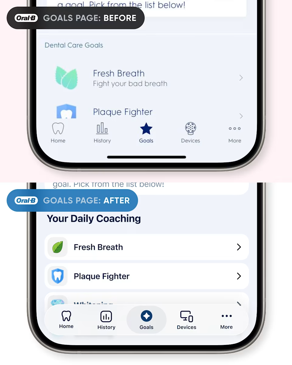
Oral-B goals page before and after: the dental care goals list, and the redesigned Your Daily Coaching list.
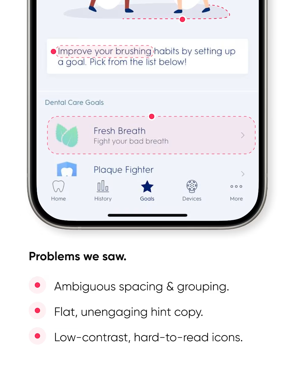
Goals page problems: ambiguous spacing and grouping, flat hint copy, and low-contrast icons.
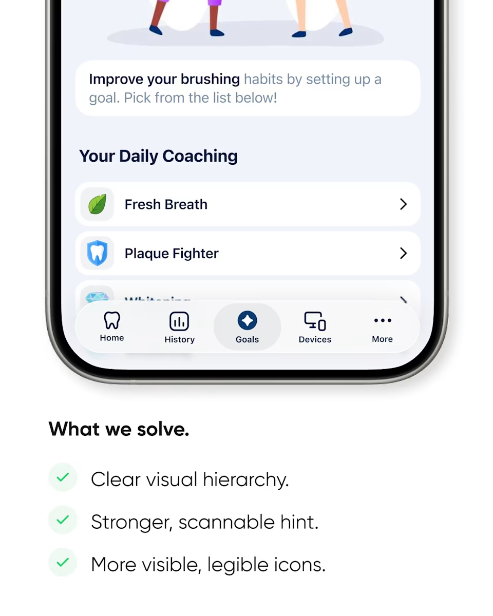
What we solved on the goals page: a clear visual hierarchy, a stronger hint, and more visible, legible icons.
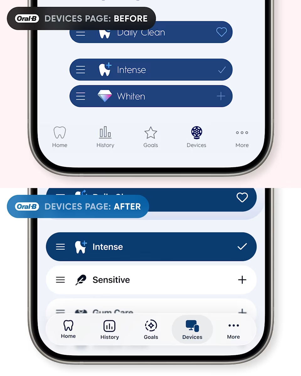
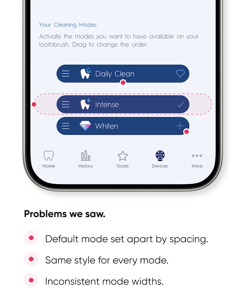
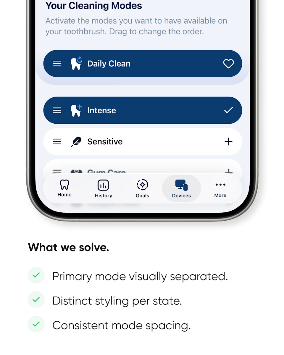
Oral-B devices page before and after: the cleaning modes list, and the redesigned list with the active mode set apart.
Cleaning mode problems: the default mode set apart only by spacing, the same style for every mode, and inconsistent widths.
What we solved in cleaning modes: the primary mode visually separated, distinct styling per state, and consistent spacing.
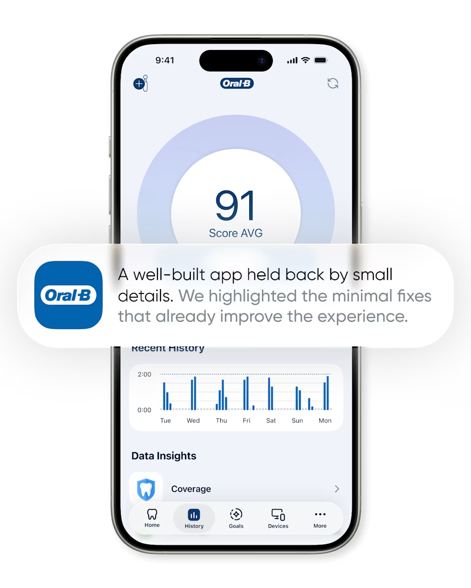
“A well-built app held back by small details.” The Oral-B score screen with a note that minimal fixes already improve the experience.
Closing slide: “Reliqio. We create apps people return to.” Struggling with UX, LTV, retention, or conversions? DM us. reliqio.com.

A UX audit of the Oral-B app, screen by screen.

Slide 1 of 12
Reliqio

A UX audit of the Oral-B app, screen by screen.

A well-built app held back by small details, and the minimal fixes that already improve it.

We took three screens and changed only what stands between the user and the next brush:

  1. Home. One card layout, a Brush Now button big enough to hit, and a navigation bar that shows where you are.

  2. Goals. A clear hierarchy, a hint worth reading, and icons with enough contrast to see.

  3. Cleaning modes. The active mode set apart, a distinct style for each state, and consistent spacing.

None of these are new features. Each one removes a reason to put the phone down, and in a daily-habit app that's where engagement, retention, and LTV are won or lost.

Want the same review of your product? Request a UX audit.

An independent design study. Reliqio is not affiliated with Oral-B.

#UXAudit #MobileAppDesign #AppRetention