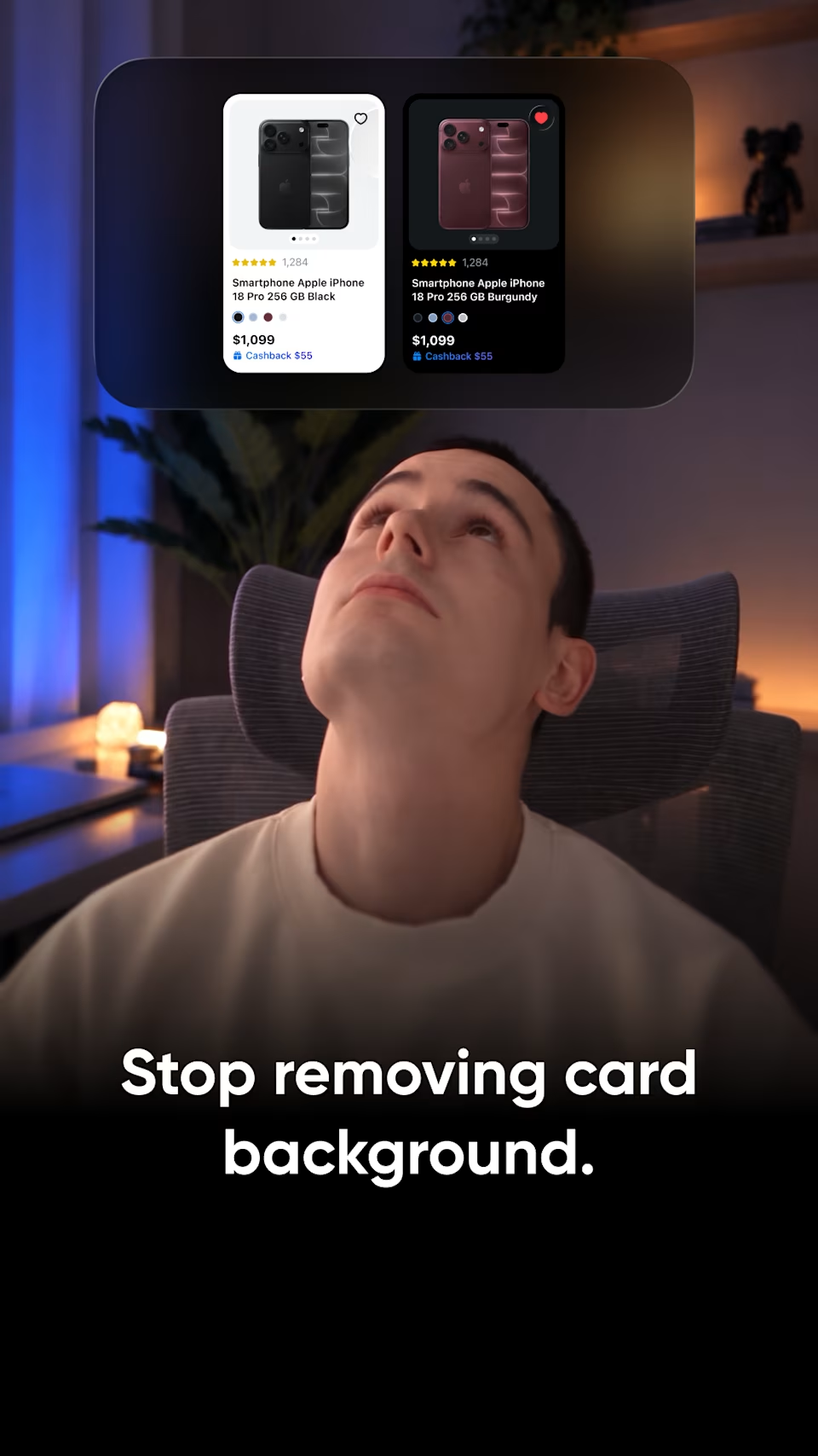
Stop removing backgrounds from cards.
Stop removing backgrounds from cards.
I keep seeing tutorials on why borderless cards are better, with examples from Apple, Netflix and Airbnb. Today I want to show the other side.
Minimal isn't always better.
Which cards do you prefer: with or without a background?
Related posts
 Convert any file just by dragging it with Shift held.
 Alex S.
 Your form design is costing you users. 4 fixes that make forms feel effortless:Alex S.
 Design for the iPhone Duo in 40 seconds.Alex S.
 The first date rule for better apps.
 Valeria B.
 You're doing your corner radius wrong.Alex S.
 Digital product design, before and after.
 Reliqio
- Stop removing backgrounds from cards.
- You've probably seen a lot of advice like this, with examples from Airbnb, Apple, Netflix.
- Clean cards, no background.
- That all works when a card shows just an image, a title, and small details.
- And on the canvas, it really looks like a good solution.
- But what if your card has a price, rating, text, and maybe a button?
- Without a background, everything floats.
- In a grid, it turns into a mess, and users quickly get lost and don't know where to look.
- A background groups all that info together.
- It's called the common region principle.
- So give each card a background and place them closer.
- Now the grid is easy to scan.
- Minimal isn't always better.
- For more on design, check out our website, link in my profile.
Borderless cards are a popular trend, with Apple, Netflix and Airbnb as the usual examples. This video shows the other side of it.
Key points:
Borderless works when a card shows only an image, a title and small details.
With a price, rating, text and a button, content floats and a grid turns into a mess.
A background groups it all together: the common region principle. Cards with backgrounds, placed closer, are easy to scan.
Minimal isn't always better: the right choice depends on the content.
Most useful for designers working on product lists and catalogues.